原出处:webdesign
转载自:iconfans
作者:nico harather
翻译:s.shek

in this tutorial you will learn how to create a nice folder for your desktop or a website.
1. first of all create a new document which is 128 x 128 pixels large and has a transparent background.
2. make a new layer, choose the pen tool and draw a shape wich is similar to this one:
在这个教程里你将学会如何为你的桌面或网页制作一个漂亮的文件夹(图标).
1,首先我们需要新建一张大小为128*128像素的画布,选择透明背景.
2,新建图层,然后使用钢笔工具画出一个类似于下图的形状.

3. now use the following settings:
gradient overlay
#ffd27a -> #ffb912
stroke
size: 1px
position: outside
color: #c07c33
inner glow
blend mode: normal
color: #ffffff
choke: 100%
size: 1px
after that it should look something like this:
3,然后将图层样式设置如下:
渐变叠加
渐变:#ffd27a -> #ffb912
描边
大小:1像素
位置:外部.(外描边)
颜色:#c07c33
内发光
混合模式:正常
颜色:#ffffff
阻塞:100%
大小:1像素
设置完这些之后你会看到如下图的效果.

|||
4. then you duplicate the layer with the shape. now you have to perspectively distort the new layer as shown on the picture:
4,然后复制一层.现在我们需要在新层上进行透视变换.(自由变换 -> 透视)

and now scale it down a little bit, so that it looks like an 3d opened folder:
然后把这里向下缩小一点,让它看起来像3d的打开文件夹.
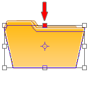
the result of step 4:
第四步的效果如下:

5. in this step we're going to add a piece of paper. so make a new layer and draw a shape like the one on the picture:
5,这一步我们将制作一张纸.新建图层,画上如图的形状.

6. now go to the layers palette and use the following settings:
gradient overlay:
opacity: 10%
#000000 -> #ffffff
angle: 50°
stroke
size: 1px
position: outside
color: #d6d6d6
it should now look similar to this one:
6,接着将图层样式设置如下:
渐变叠加
不透明度:10%
渐变:#000000 -> #ffffff
角度:50°
描边
大小:1像素
位置:外部
颜色:#d6d6d6
现在看起来应该像这样:

|||
7. next you turn the piece of paper to the left a little bit and put this layer under the layer with the 3d folder thing from step 4.
7,接着把这张纸向左旋转一些,然后把这个图层放在第四步的图层之下.

8. that looks quite nice, but the thing wich makes it look like a really cool icon, is to set the opacity of the 3d folder part to about 50-60%.
8,现在看起来就漂亮多了,但是我们还可以让它更酷一些,只需要把第四步的图层的不透明度设置在50%-60%左右.

that's it. you can add some details and use it for a website or make an .ico file and use it for your desktop.
thats what i came up with in the end:
就是它了! 你可以再为它增加一些细节,然后用在你的网页上,或者把它制作成.ico格式的图标应用在你的桌面上.
下面就是我最后做出来的:

two other things wich i made with exactly the same folder parts:
我在相同的文件夹上做出的另外两种效果:


i hope you liked my first tutorial, and i'm looking forward to make another one soon!
have fun!
新闻热点
疑难解答