
Learn how to control your colours, and take advantage
of different colour theory principles to make your art pop!
Hands down, on the ranking of the most important art principles, you find colour theory on a solid second place, only beaten by the most important theory; values. From all of the different aspects of art studies, colour studies are probably the most studied of them all, and it's probably also the hardest one to master. Staying on top and handling the most important principles of art will give your advantages in the art scene for sure and shouldn't be overlooked.
学习怎么控制色彩,在不同色彩理论中吸取精华,让你的艺术作品变得更受欢迎!
我们按照艺术理论的重要性来排列,你会发现色彩理论排在第二位,仅次于最重要的:明度(这里指的是用素描关系绘制体积)。在艺术研究的不同方面里,色彩研究也许是最深奥的。而且也许是最难精通的。我们能肯定的说,掌握和处理最重要的艺术原理能够让你的艺术作品增添魅力,而且这也是不容忽视的。
The main characteristics of colour
The principle of colour might seem simple enough, but taking the four main characteristics of colour into consideration; hue, value, saturation, and temperature, there are really no limit of what you can do with this if you know a little about how it all works. There's a lot of theory and studies on colour principles, and you don't need to know them all to be able to create nice compositions of colour, but knowing a few of them is a good start for any artist.
色彩的主要特性
色彩原理看起来好像很简单,但是我们来考虑色彩的四个主要特性:色相,明度,饱和度(也就是纯度)和色温(色温简单说就是平常大家说的冷暖),如果你对这些色彩特性是怎么工作的了解一点的话,那么它们对你该怎么去画是毫无限制的。色彩原理的理论学科有很多种,不是需要了解所有理论才能创作出好的色彩作品,但掌握些理论对任何一位艺术家来说都是个好的开始。
Simultaneous contrast
同步对比
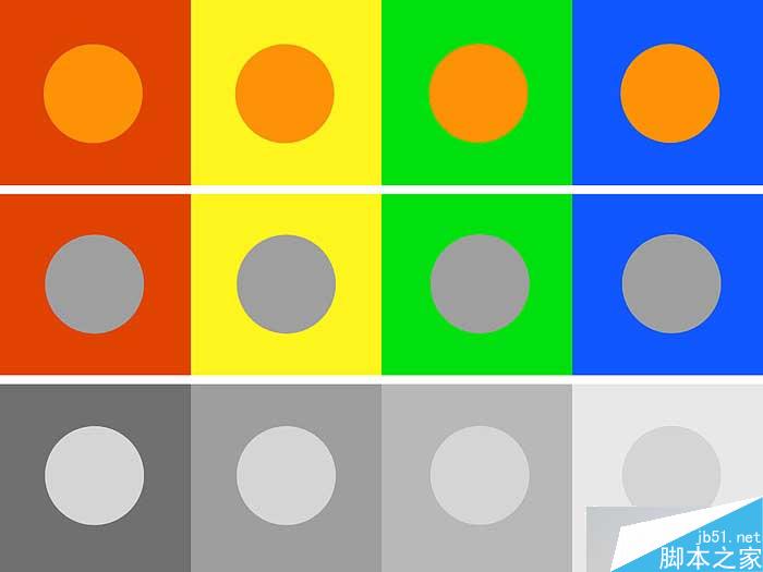
All colours and even greyscale values are influenced by their surrounding colour, and can be used in several ways to create the expression you're aiming for. This is important to keep in mind when choosing your palette, and if you're planning on having a strongly saturated and dominant background colour, make sure to put the influence of this colour into account early in the process when blocking in your composition.
Surrounding colours also influence grey-scale surfaces. Look at the centre example and notice that the grey circles seem to absorb some of their surrounding colour. This can be used to create some very special and interesting effects in your compositions. The grey circles at the bottom all have the same greyscale value, but are influenced by their surrounding value and therefore appears to be different from each other.
所有色彩甚至包括灰色,都会受到周围颜色的影响,色彩的这种特性可以通过各种方式应用到你的作品当中。当你选择色板的时候考虑到这一特性是非常重要的。而且当你打算用饱和度很高和面积很大的背景颜色时,确定在色彩草图之前的阶段就把颜色相互影响的特性考虑进去。
环境颜色同样会影响到灰色,看例图的中间一栏你就会发现灰色的圆点好像吸收了周围的颜色。这可以在你的作品中创作出一些特别而且有趣的效果。最下面一栏的例图中,圆点的明度都是一样的,但他们周围的颜色对圆点产生了影响,使它们看起来有了不用的明度。
The power of complimentary colours
补色的力量
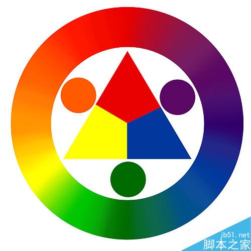
Now, let's take a look at that slightly intimidating device known as the colour wheel; what would an article about colour be without one, right? When working digitally, the importance of the three primary colours (the triangle in the centre) aren't that important as you mix colours differently on the computer, but you can still use this wheel to figure out your complimentary colours. If you look at the outer ring, the colours positioned perfectly opposite each other are complimentary to the other; red versus green, blue versus yellow, and so on. These colours have the strongest contrast, colour-wise and are a good choice to use in areas of interest to bring out attention to specific part of your painting. Mix the two complimentary colours, and you end up with a neutral colour.
现在我们来看下这个有点诡异的东东,大家都管它叫色环~色环对于色彩作品来说是多么的不可或缺啊,是吧?当我们进行数字绘画时,三原色(中间的三角形就是三原色了)的重要性比你自己在电脑上调出来的各种颜色差远了,(其实传统绘画不也这样嘛。。。都用原色画会崩溃的。。= = 老外废话多?)但这个色环会指导你补色的运用,外环上颜色的位置很好的显示了补色位置,红对应绿,蓝对应黄,等等。(色环上相对180度的颜色互为补色)这些颜色有着很强对比度和色性,用这些颜色来突出画面的视觉中心,增加画面趣味性是个不错的选择。把互为补色的颜色混合得到的是偏中性的颜色。
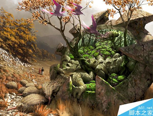
Simon Dominic is using complimentary colours on this painting to bring out the purple birds towards the green main element in the composition.
Simon Dominic(上图作者名)在这张画中,通过运用补色使在大面积绿色元素上的紫色小鸟凸显了出来。
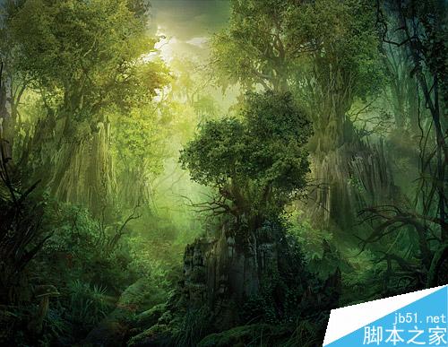
Colours have weight, and it's quite simple; the darker the colour, the more solid and heavy the painted object will appear. The brighter colour and values, the lighter and more delicate the painted object will seem. You should use colour weight to balance your composition, and for creating striking moods. Philip Straub is using colour weight to bring out the main element in focus and balancing the composition in this painting. This is a great way to empathize areas when you're working within a limited colour range and don't want to use complimentary contrast as an attention seeker.
颜色有重量感,非常简单,深色看起来更重,存在感比较强,亮色和明度高的颜色看起来更轻更精致,亮色画出来的东西比较虚无飘渺。画面需要色彩的量感来平衡,并以此取得吸引人的气氛。Philip Straub(上图作者名)用颜色的量感来突出主题元素使画面得到平衡。这是当你只能用有限的颜色和不想使用补色的时候,用颜色的量感突出视觉中心的很好方法。
Stick with it
确定配色表
Once you're in the process of deciding on a colour scheme, no matter if you're starting off with colours from of the first rough, or if you already have a grey-scale version ready of your composition; create your colour scheme and stick with it. Altering too much throughout the process might mess things up more than you think. Minor tweaks are naturally a necessity if needed.
一旦你开始决定配色方案,无论是从最初的色彩草图还是已经完成的黑白稿版本,确定你的配色并按照配色表的颜色去画,在绘画的过程中不停的修改颜色会使画面比你想象的还要糟糕。如果需要的话做些小的调整时可以的。
Add depth with colour
用颜色制造景深
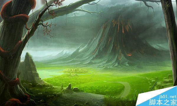
An efficient way of supplementing depth to a painting with already good values is taking advantage of the effect of warm and cool colours. This can be done quite simply by using warm colours on elements close to the viewer, and keeping the background elements and backdrop with cool colour. This is because warm colours seem to come forward and cool colours seem to recede away. You can also use the same effect to also create striking contrast in mood, as shown on this beautiful landscape by Gary Tonge.
有效的给一幅作品增加景深的方法是利用色彩冷暖的优势,这么做很简单,只要在近景部分用暖色调,然后保持背景元素的冷色调就可以了。这是因为暖色有向前的感觉,冷色有后退的感觉。你可以用同样的方法创造出令人着迷的气氛。我们展示下Gary Tonge(上图作者名)这张漂亮的风景画。
Light, shadow and colour
光影和颜色
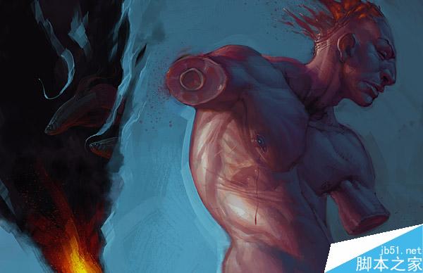
When painting any subject, light and shadows are what will build the shapes in the piece. Values are extremely important to be settled early in the process, and when the final thrust of the creative effort is set by adding colour to the light and shadows, your piece will really spring to life.
Keep what was mentioned earlier in mind about adding depth with colour and settle for a colour for your main light source, and a colour for your ambient light. The ambient light is the space that your character or scene is set inside. If you have a clear blue sky, your ambient will be blue because of the massive blue sky-dome covering the scenery, and this colour will influence all of your objects from all angles, and especially the shadowed areas. This is why we often see that blue or purple shadows or backlights/rim-lights always seem to work out nicely in paintings.
Here, Izzy Medrano is using a main light source from the left, and using the surrounding, blue, ambient light make up the shapes of the shadowed side of the character.
画面中,光影塑造形态,体积和素描关系在初始阶段中确定下来非常重要。当最终的创造性的效果通过颜色和光影加到画面中的时候,你的作品就会鲜活起来。
保持对作品的第一感觉,包括颜色塑造的景深,对主光源和环境光制定的色调。环境光取决于你在画面中设定的角色或场景的空间,如果画面中有蔚蓝的天空,你的环境光应该是蓝色,因为宽广的蓝色天空覆盖了整个场景。这种蓝色会从各个角度影响到场景中的所有物体,特别是阴影部分受环境光影响最明显,这就是为什么我们经常能看到画面中很漂亮的蓝色或紫色的阴影或逆光下轮廓的蓝紫色高光。
这幅作品zzy Medrano(上图作者名)在画面左边设置主光源,然后利用周围环境,蓝色环境光塑造角色阴影中的形体。
Environmental influences
环境的相互影响
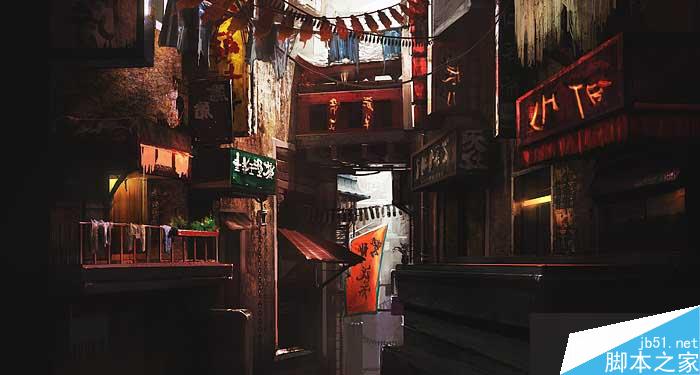
If you want to take the previous principle about light and ambient light and complicate it a bit further, you can start thinking about what material the different surfaces in your scene is made out of and how they all will reflect and bounce off light. The light will then cast shadows which will have to be sorted out as well. Looking at this alley painted by Levente Peterffy, you will see that he has taken advantage of ambient lighting to establish depth, and shadows for grounding the lit parts of the composition. Softening out the lit and saturated parts makes it appear as if the air around appear lit, which makes for the delicate and soft expression in this piece.
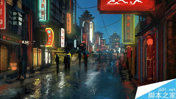
The same goes for semi transparent colourful surfaces, or solid yet strongly saturated elements where the colour of the surface will bounce off and tint the surrounding areas, both the air and surfaces, as Daniel Kvasznicza is nicely showing on his Chinatown conceptual sketch.
如果你想用之前关于光线和环境光的理论去继续深入你的作品,你可以考虑下作品中各个物体不同的材质表面,这有助于你想象出各物体间相互影响的反光。光投下阴影,场景场景中的物体也就区分出来了。我们看Levente Peterffy(上图作者名)画的这幅小巷,作者用环境光来表现景深、地上的阴影和画面中的光感。柔化光线,饱和度高的部分会体现出光感,就像空气弥漫在光线周围,使整张画面色调柔和精致。
这同样适用于半透明物体的表面,或者固体但饱和度高色彩浓烈的物体,物体表面的颜色会反射影响到周围区域,包括周围的空气和物体表面。就像Daniel Kvasznicza(下图作者名)漂亮的展示出了他的唐人街概念草图。
Areas of interest
趣味中心

The same way as using strong contrast when working with values, adding attention to specific areas in your composition can and should be done with colours as well. Therefore; hold your horses, and don't use your colours on full strength all over your canvas, but reserve the strongest hues for areas of interest. Using complimentary contrast or simply stronger hues of a specific colour will work as an automatic attention seeker, and can be used cleverly if you are aware of how to take advantage of this effect. Remember that a painting with dull hues all over will be hard to read. You need strong colours to function as eye-catchers, but only in the right places.
In this painting, Simon Dominic has taken great advantage of colour saturation to empathize the unique features of the main character, and left the rest of the composition less saturated, yet within the same colour range. Add more saturation to the background and the painting would be hard to read.
我们应该而且必须同样的方法加强明暗对比和色彩对比,使画面中特殊区域引人注意,因此,请再三考虑,不要使整个画面处理的太平均,要让最漂亮的颜色在画面的趣味中心,对比强烈的补色或是饱和度高的颜色会自动抓住人的视线。你如果意识到这种效果带来的好处,就会聪明的运用它。记住用暗淡无趣的颜色画出的作品会让人很难接受,你需要用浓烈的色彩抓住人的视线,但一定要用在正确的地方。
在这张图里,Simon Dominic(上图作者名)利用饱和度高的色彩的优势,使视线集中到了这个独特的角色上,让画面其它部分的饱和度降低但不能差别太大。如果使背景饱和度变高整个画面会很难看。
Single-coloured surfaces
单色表面
Unless it's the expression you're aiming for, having clean, single coloured surfaces can make your painting seem a lot duller than it could be, no matter how strong that colour is. Texture is key; try messing up that surface a bit with some textured brushes, or a simple noise and you'll see that simple measures like this can create interesting surfaces and make your painting come to life, even if the noise is within the same colour range as the clean base colour.
除非有特殊需要,干净单一的表面会使你的画面单调无聊,无论这颜色多纯都一样,纹理是关键,试着用些笔刷让表面增加一些纹理或是简单的杂色。你会发现这些简单的方法可以创造出有趣的表面,并使你的画面鲜活起来,甚至这些杂色下是相同的单一基本颜色。
Using complimentary colours to bring out areas of interest
用补色突出趣味中心
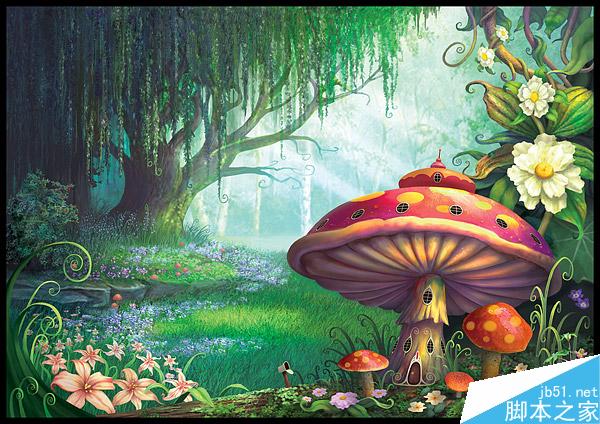
An expressive and efficient way of adding depth and settling where to put the areas of interest is by using complimentary colours. On this painting by Philip Straub, he is using the complimentary contrast of the red mushrooms and the green backdrop to make his composition easy to read. He is also taking advantage of colour saturation to bring out the foreground by keeping the background duller both in values and colour saturation.
用补色来增加景深和刻画趣味中心是一个有表现力而且有效率的方式,在Philip Straub(上图作者名)这幅画中,他运用红蘑菇和绿背景的补色对比使作品变得好看,同样他利用高饱和度的优势使前景突出,背景的颜色饱和度稍稍降低使背景退到远处。
Using warm and cool colours to create depth
利用冷暖制造景深
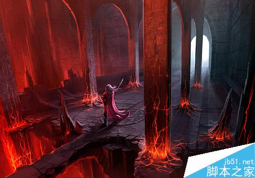
Gary Tonge is showing a great example of how good composition and colour handling can make a painting really pop. By using warm colours close to the viewer, and cooler colours further away, the combination of colours will add depth to the piece because warm tones seem to come out towards you and cool colours recedes. The nice perspective of this specific piece and the placement of the point of interest are also helping.
Gary Tonge(上图作者名)给我们展示了很好的例子,通过颜色处理使作品突出出来。作品中近景使用暖色,越远的物体颜色越冷,这种颜色组合会使增加景深,因为暖色感觉向前,冷色有后退的感觉。整张画漂亮的透视和趣味中心的布置安排都使画面增色不少。
Colours influenced by environment
环境对颜色的影响

The atmosphere in this painting by Gary Tonge is bathing in a beautiful, golden light, which is influencing the entire scenery. Any other stronger colour or complimentary contrasts would break the wonderful mood he has created here. He is also relying on colour weight to make the structure closest to us appear more solid and heavy.
Gary Tonge(上图作者名)这张作品的大气中弥漫着漂亮的金色光芒,光线影响着场景中所有物体,任何其它的颜色和补色对比都会对这漂亮的气氛造成破坏。他这里也利用颜色的重量感使前景的建筑看起来结实厚重。
Step 1, getting the base values up
步骤1,画出基本的明暗光影
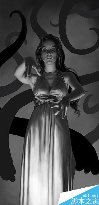
As already mentioned; having good values is crucial for your painting to work. No matter how well the colours are composed, bad values can still break the piece and it will be hard to read. If it works well in grey-scale as well as in colour, then you've succeeded.
就像之前提到的:好的明暗关系对整张画来说至关重要。不论色彩多漂亮,差劲的明暗关系仍然会破坏效果,使整张画很难看。如果画的明暗和色彩一样好,那么你就成功了。
Step 2, applying basic colour
步骤2,铺大体色调

I wanted to create depth to this painting, even though it's a very simple composition. I decided to use a cool colour for the background because cool colours appear to recede back into the canvas. I wanted the woman's skin and dress to consist of a warm palette, along with the closest tentacles to drag them closer towards the viewer and away from the cool background.
我想在这幅作品中加入景深,即使这是一张很简单的画。我决定用冷色来画背景因为冷色给人向后退的感觉,我想让图中的女人皮肤和服饰偏暖,和最近的触手一起拉到近景,远离背景。
Step 3, adding the final pass
步骤3,最终完成

Adding more contrast around the woman's head will work as an attention seeker, and I also applied a blue backlight-rim around her and on the closest tentacles to link them to the blue background. If you look at the top of her dress, you can see how the blue light is bouncing off her dress, and also how her raised arm reflects some warm shades of light as well.
在女人头部周围增加对比,使之更吸引眼球,加入蓝色背光提亮女人和触手的轮廓,使得在颜色上和背景联系起来。在她的衣服上部你会看到蓝色反光是怎么反射到衣服上的,还有她抬起的胳膊上反射的光的暖色阴影。
以上就是色彩的原理应用教程,教程很不错,希望大家喜欢!
新闻热点
疑难解答